The chart view
Goal of this article: plot the variable you actually want against range, and get a readable curve rather than a flat line at the bottom of the frame.
The chart shows one variable of the same trajectory the table lists, against range. It is for the shape of
things — where velocity falls off a cliff, where the trajectory crosses the sight line, how two loads
diverge — not for reading a number off, which the table does better. Reach it with Ctrl+C or
View → Show → Chart.
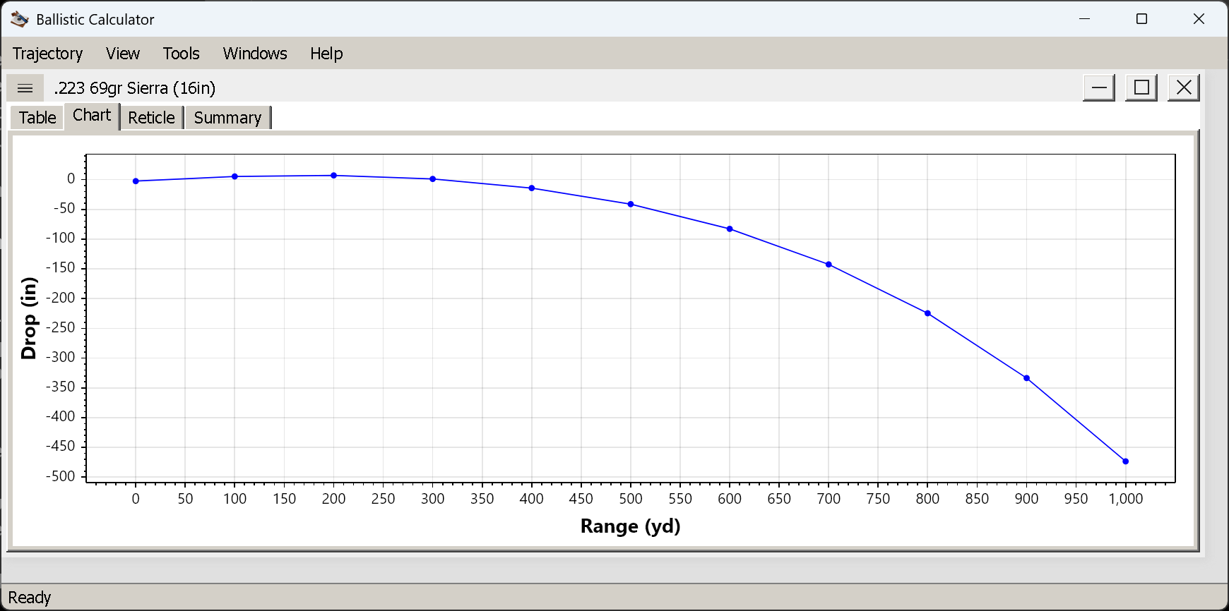
Drop against range, one series, with a marker at each step of the run.
Choosing what to plot
View → Chart offers five variables:
| Variable | Y axis | What it is good for |
|---|---|---|
| Velocity | ft/s or m/s | Where the load runs out of steam; the shape is steepest early |
| Mach | bare number | Where the bullet goes transonic — the line crossing 1.0 |
| Drop | in or cm | The trajectory itself. See the two-curve mode below |
| Windage | in or cm | Wind, spin drift and Coriolis combined, growing faster than linearly |
| Energy | ft·lb or J | Threshold questions — where the load falls below a number you care about |
The X axis is always range in the window’s unit. Points are marked at each step of the run, so a coarse step gives a chart with visible markers and a fine step a smooth line — the underlying trajectory is the same either way (see the Parameters tab).
The one mode that shows you something new
Set View → Chart → Drop and View → Drop → Over Muzzle Level, and the chart draws two curves:
the bullet’s path against the horizontal through the muzzle, and the line of sight as its own line.
That is the classic textbook picture, and it is the one thing here the table cannot show you: the bullet starting below the sight line, crossing it at the near zero, arcing above, and crossing back at the zero distance. The vertical gap between the two curves is the drop over line of sight — the column you hold by. Seeing the two lines makes the near zero, the mid-range rise and the far zero obvious in a way a column of numbers does not.
On a level shot with Over Line of Sight selected you get one curve instead, which is the same
information with the sight line flattened onto the axis.
Zoom, and the flat-line problem
The plot pans and zooms with the mouse. Zoom into a stretch of range — say 800 to 1,000 yd — and you will often find the curve pressed flat against the bottom of the frame: the Y axis still spans the whole trajectory, including the part you zoomed away from.
View → Chart → Zoom Y Axis to Visible Range (Ctrl+Shift+Z) fixes exactly that. It rescales the Y
axis to the points inside the current X range, so the detail you zoomed in for becomes visible. It is the
menu item you will use most on this view.
Re-selecting a variable from View → Chart re-autoscales both axes, which is the quickest way back to a
sane view.
One shot here, several in the Compare window
This view charts one trajectory: the one in its own window. A legend is drawn only when there is something to disambiguate — in the two-curve drop mode above, naming the bullet path and the line of sight — and a single curve gets none.
To put two loads side by side, View → Compare → Add builds a separate window from the trajectories you
have open. It uses this same chart, so everything on this page applies there too.
📖 Comparing loads — building a comparison, why it is a snapshot rather than a live link, mixed units, and what is actually worth comparing.
Things worth knowing
- The chart follows the window’s settings. Measurement system, angular units and the drop convention all apply here; changing them redraws the chart.
- A curve that ends early is not a truncated chart. The run itself stopped — the load went subsonic and slow, or fell 10,000 ft. Same reason the table ends early.
- Windage can be negative. Positive is left, as in the table, so a right-twist rifle with no wind gives a curve heading downward.
Next
The reticle view — the same trajectory as a sight picture through your own reticle.